Tips for Data Visualisations
Data Tools
- JavaScript + D3
- CSS + HTML: https://www.udemy.com/build-website-scratch/
- https://www.udemy.com/masteringd3js/
- https://www.udemy.com/modern-javascript-from-the-beginning/ or https://www.udemy.com/the-complete-javascript-course/
- https://www.udemy.com/svg-animation/
- https://www.quora.com/How-do-I-learn-D3-js-What-is-its-background-What-is-it-How-does-it-work-Do-you-need-any-software-What-are-the-best-resources-to-learn
- https://d3js.org/
- R Shiny Dashboards
General Tips
- Albert Einstein: “Everything should be made as simple as possible, but not simpler.”
- It depends whether operational overview or having a strong message
- "It depends" idea – consider purpose, audience, chart, LoD
- Using Tableau for data mining and storytelling
- Design it the way it is natural for the user > "they are a king"
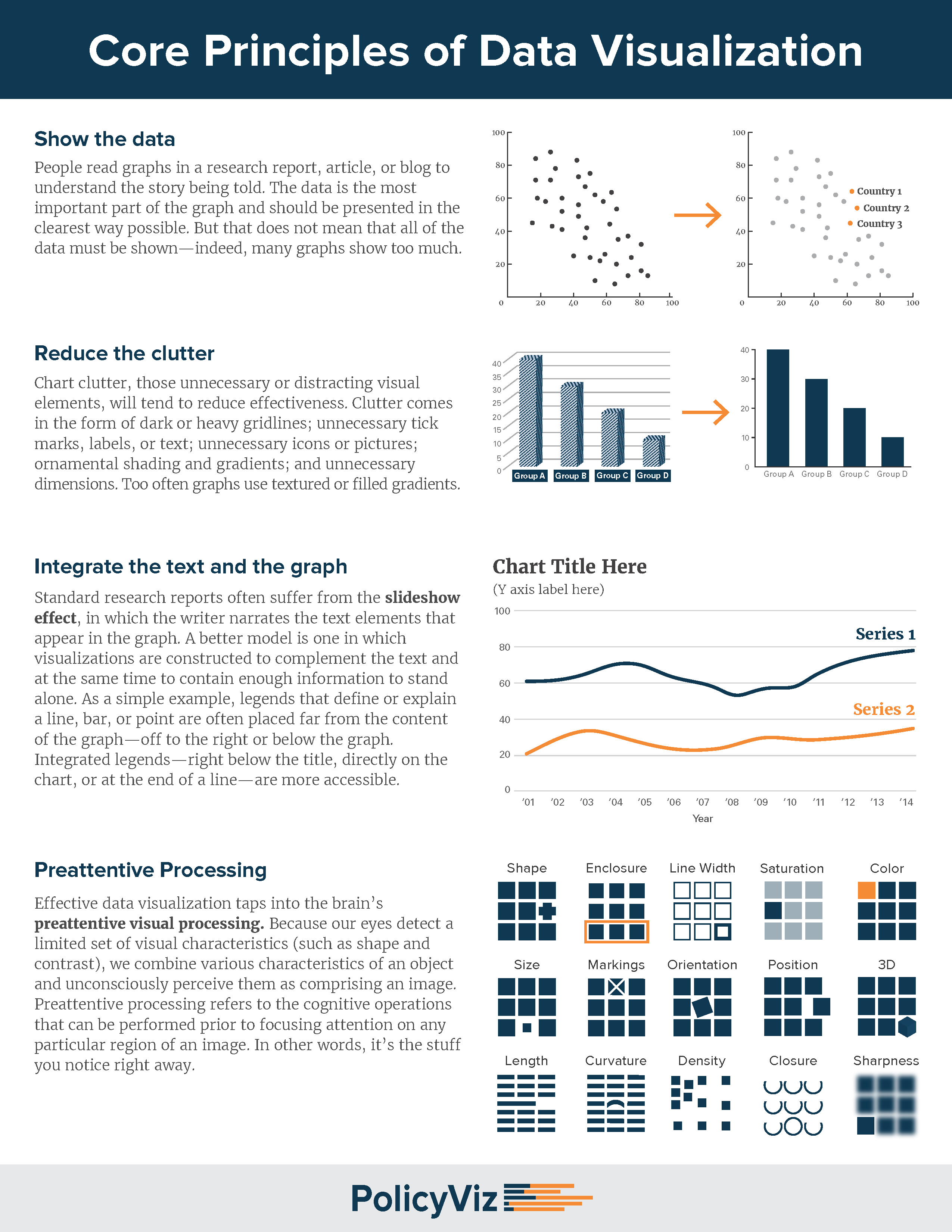
- Don't make it too cluttered > enough space around vizes > "data-ink ratio"
- Only data should be seen
- Always make sure the data are correct before sending them out
- Use colour for the context > strap it and build back
- making numbers human through scaling and comparisons
- visuals should be rewarding = you should learn something
- visuals should be simple to understand and pleasing
- Headline should be a story, subheadline could a description
- Uncover users' needs: Situation Problem Implication Need > tell me what I don't know
Notes
- Tableau has its own engine – stands alone for quick data exploration, but Power BI and Qlick use D3, so they are limited to reporting for which it was meant > you cannot find things that you don't know
- Cord Chart
- How to save up some space in dashboards?
| ../../assets/files/ttt-may-18- saving-space.twbx | Tiny Tableau Talk May 2018 - Saving space in dashb.twbx |
- How to do chart with spikes around the clock = radial bar chart?
| ../../assets/files/london-cycle-hire-usage.twbx | London Cycle Hire Usage (MakeoverMonday W26).twbx |
- How to do a donut chart + comparison of two bar charts by "needle"?
| ![../../assets/files//australian-wage-gap.twbx | Australian Wage Gap.twbx]] |
- How to create "density"?
- Just put there large circles and give small opacity.
- Cool way to do a zig zag chart.
- Need to sort?
- Use parameter to choose the correct dimension and then put it into the table, sort A-Z, but hide it.
- Photos to Rows
- Create own palette with matching names and then use it
Documents
| ../../assets/files/viz-tips.pdf | Viz Tips.pdf |
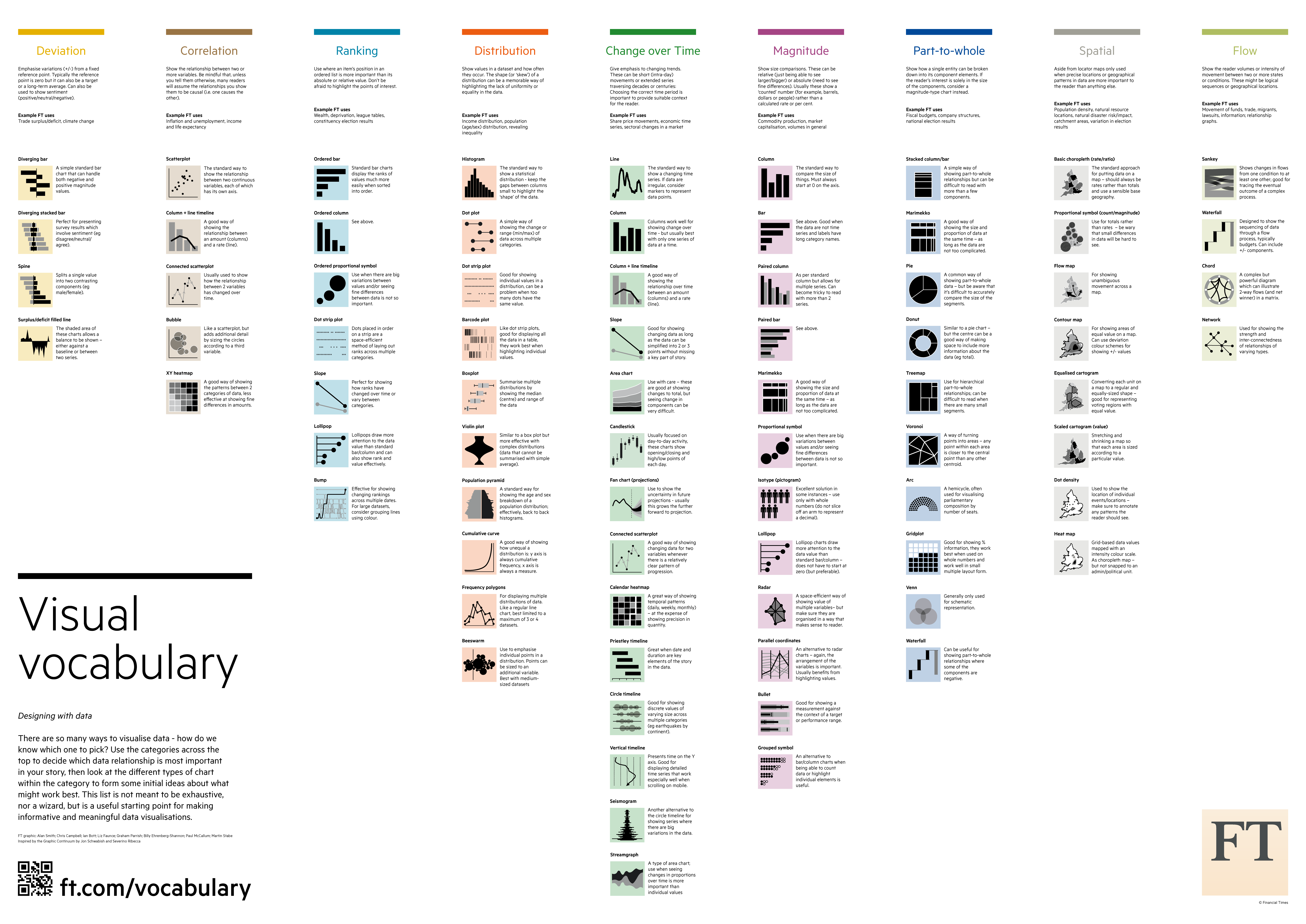
http://ft-interactive.github.io/visual-vocabulary/ https://github.com/ft-interactive/chart-doctor/tree/master/visual-vocabulary https://policyviz.com/2014/09/09/graphic-continuum/ https://www.vizwiz.com/2018/07/visual-vocabulary.html
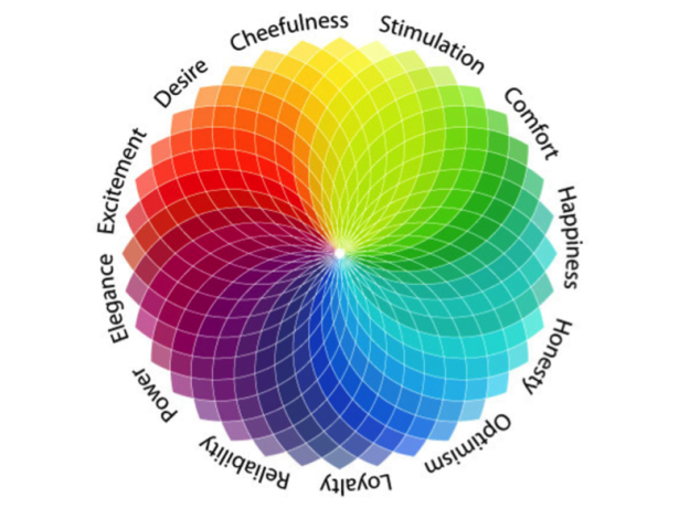
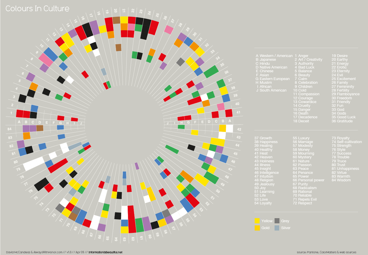
| data-viz-links.pdf | Data Viz Links.pdf |
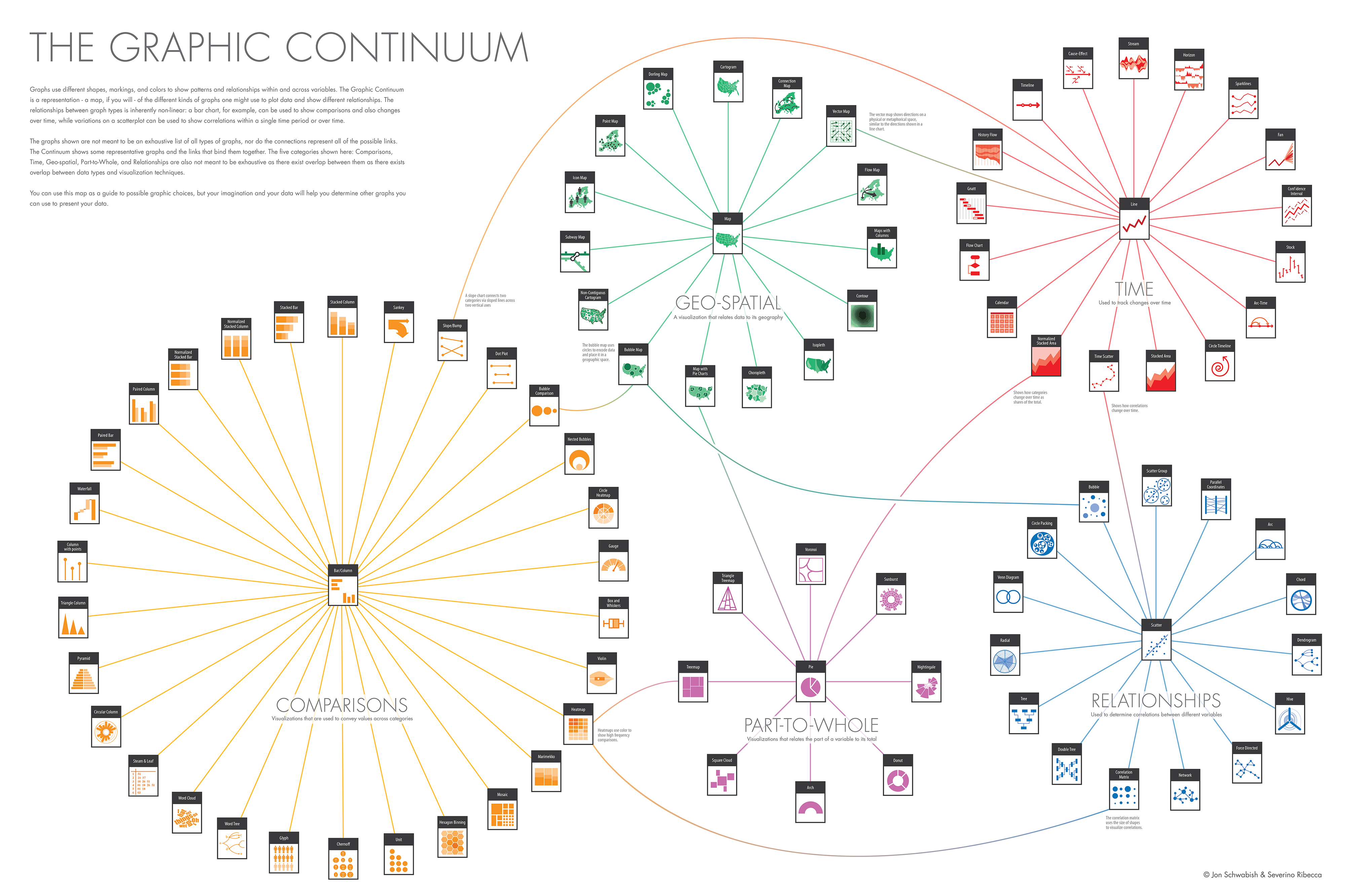
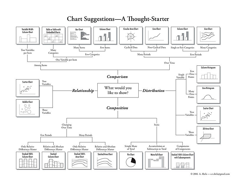
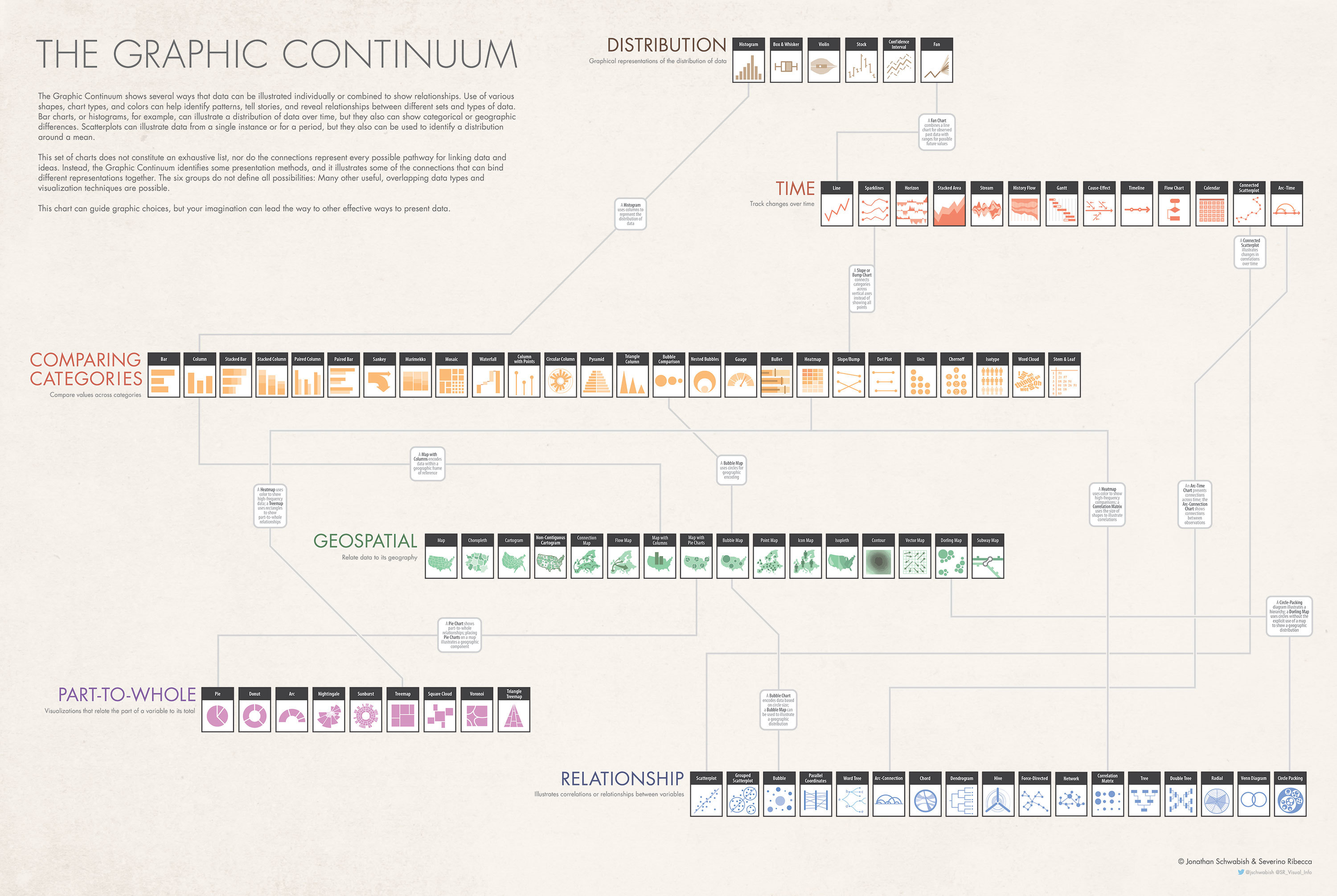
- Could be bought as a poster here
Created: 2018-05-16T14:52:08+02:00
Updated: 2019-07-07T18:21:30+02:00
Source:  http://www.makeovermonday.co.uk/week-32-2018/