Main Idea of the Book
Part I: Graphical Practice
1 Graphical Excellence
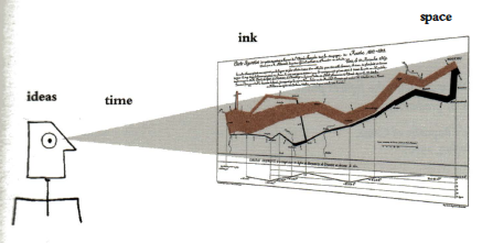
Graphical excellence is the well-designed presentation of interesting data – a matter of substance, of statistics, and of design. Graphical excellence consists of complex idea communicated with clarity, precision, and efficiency. Graphical excellence is that which gives to the viewer the greatest number of ideas in the shortest time with the least ink in the smallest place.
 Graphical excellence is almost always multivariate.
Graphical excellence requires telling the truth about data.
Graphical excellence is almost always multivariate.
Graphical excellence requires telling the truth about data.
- "A silly theory means a silly graphic."
- Data Maps: Flow graphs within maps:
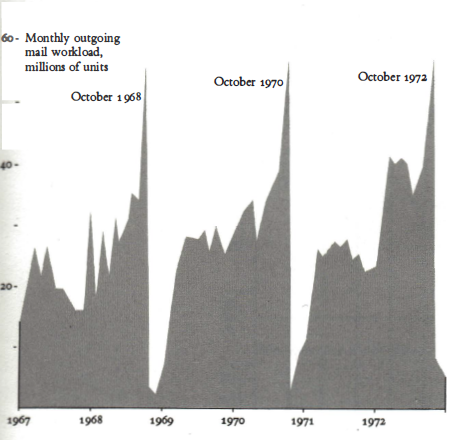
- Time-Series: "Time-series displays are at their best for big data sets with real variability. Why waste the power of data graphics on simple linear changes."
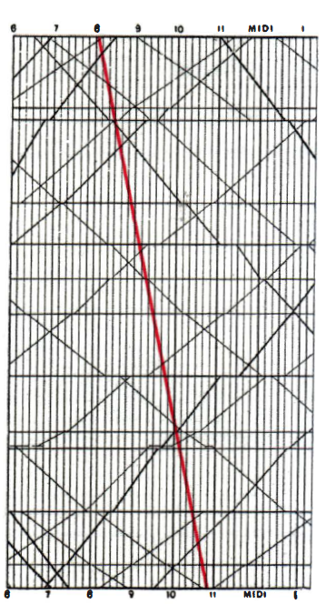
- Time-Series, genious:
- Time-Series: "The problem with time-series is that the simple passage of time is not a good explanatory variable: descriptive chronology is not causal explanation.":
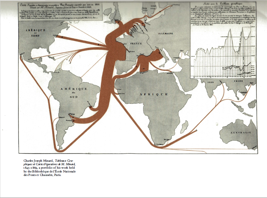
- Narrative Graphics of Space and Time: "An especially effective device for enhancing the explanatory power of time-series displays is to add spatial dimensions to the design of the graphic, so that the data are moving over space (in two or three dimensions) as well as over time.":
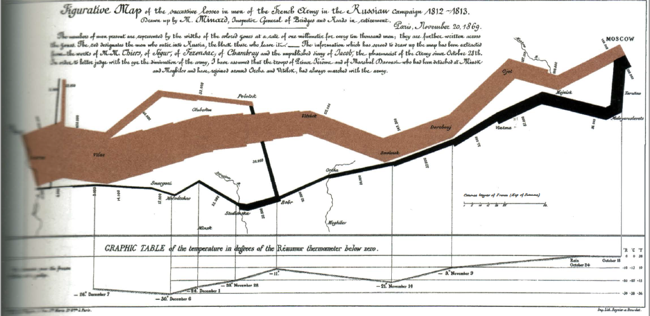
- Narrative Graphics of Space and Time: "Small multiples are economical: once viewers understand the design of one slice, they have immediate access to the data in all other slices."
- Relational Graphics: "The relational graphics – in its barest form, the scatterplot and its variants – is the greatest of all graphical designs."
2 Graphical Integrity Graphical integrity is more likely to result if these six principles are followed:
- The representation of numbers, as physically measured on the surface of the graphic itself, should be directly proportional to the numerical quantities represented.
- Clear, detailed, and thorough labelling should be used to defeat graphical distortion and ambiguity. Write out explanations of the data on the graphic itself. Label important events in the data.
- Show data variation, not design variation.
- In time-series displays of money, deflated and standardised units of monetary measurement are nearly always better than nominal units.
- The number of information-carrying (variable) dimensions depicted should not exceed the number of dimensions in the data.
- Graphics must not quote data out of context.
- James Thurber, Further Fables for Our Time (New York, 1956): "Get it right or let it alone. The conclusion you jump to may be your own."
-
Distortion in Data Graphic:
- "A graphic does not distort if the visual representation of the data is consistent with the numerical representation."
- "__The special power of graphics comes in the display of large data sets."
-
"The representation of numbers, as physically measured on the surface of the graphic itself, should be directly proportional to the numerical quantities represented."
- "Clear, detailed, and thorough labelling should be used to defeat graphical distortion and ambiguity. Write out explanations of the data on the graphic itself. Label important events in the data."
- "It is wrong to distort the data measures – the locating values of numbers – in order to make an editorial comment or fit a decorative scheme"
- Design and Data Variation:
- "__Show data variation, not design variation."
- "__In time-series displays of money, deflated and standardised units of monetary measurement are nearly always better than nominal units."
- Visual Area and Numerical Measure:
- "__Many published efforts using areas to show magnitudes make the elementary mistake of varying both dimensions simultaneously in response to changes in one-dimensional data. (…) The number of information-carrying (variable) dimensions depicted should not exceed the number of dimensions in the data."
- Context is Essential for Graphical Integrity:
- "__Graphics must not quote data out of context."
- Conclusion:
- "__It is the special character of numbers that they have a magnitude as well as an order; numbers measure quantity. Graphics can display the quantitative size of changes as well as their direction.
3 Sources of Graphical Integrity and Sophistication The conditions under which many data graphics are produced – the lack of substantive and quantitative skills of the illustrators, dislike of quantitative evidence, and contempt for the intelligence of the audience – guarantee graphic mediocrity. These conditions engender graphics that (1) lie; (2) employ only the simplest designs, often unstandardised time-series based on a small handful of data points; and (3) miss the real news actually in the data.
Graphical competence demands three quite different skills: the substantive, statistical, and artistic. Let's reject once and for all the doctrines that data graphics are for the unintelligent and that statistics are boring. These doctrines blame the victims (the audience and the data) rather than the perpetrators.
-
"__And so, just as there is a double standard of integrity at a good many news publications-one for words, another for graphics, so there is a double standard of sophistication. The statistical graphics are stupid; the prose is often serious and sometimes even demanding of expertise."
-
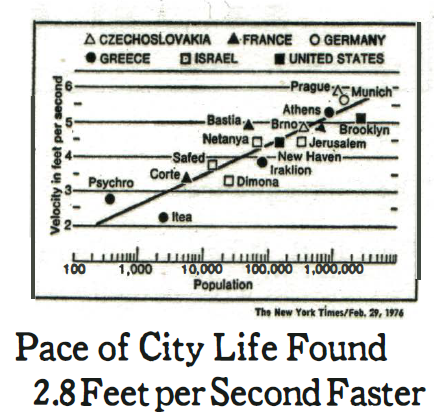
Brno in the book:
Part II: Theory of Data Graphics
4 Data-Ink and Graphical Redesign
Created: 2019-02-16T18:23:31+01:00
Updated: 2019-02-16T19:47:24+01:00