Understand how to provide feedback through dashboards
- “What you measure, you improve.” But how does this actually work?
- To understand effective, motivational data design, you need to understand the psychology of feedback.
- Effective dashboards provide effective feedback and rely on two dynamics:
- They increase our commitment to a goal; by:
- Highlighting past progress (e.g., Atom, fundraising progress bars)
- Making the feedback experience itself rewarding or fascinating (e.g., Atom, Robinhood)
- Downplaying failures (e.g., weight graphs)
- Shrinking the perceived distance to a larger goal (e.g., fundraising thermometers)
- They draw contrast between our current state and goal state; with:
- Two numbers (e.g., speed limit signs)
- Long distance goals (e.g., weight graphs, fundraising progress bars)
- Social comparisons
- Various benchmarks (e.g., Tufte and Powsner, Worklytics)
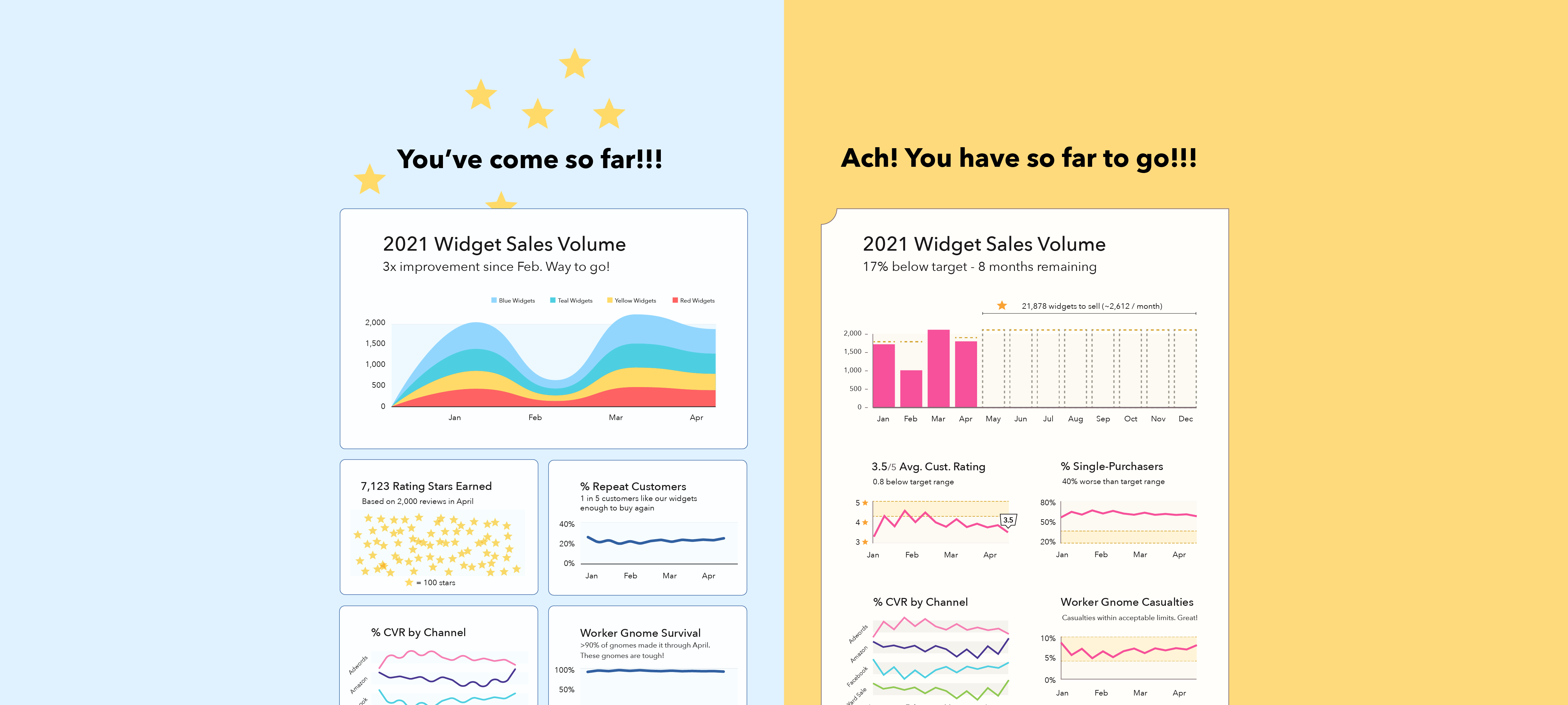
- Example: The left speaks to viewers’ commitment. The right highlights the contrast between users’ current and target states.
Metadata